Tag: statistics

Outnumbered

Any political system requires “buy in” from a very large percentage of those being governed. If the 600,000 people who live in Wyoming thought they had absolutely no say in how the country ran because there are like 8 million people in NYC, 3.5 million in LA. Or even the just about 600,000 people who live in Harrisburg, PA … they don’t have much incentive to peaceful participation in the federal government.

I hear folks in rural parts of Ohio saying the same thing — cannabis will be legalized because of the three C’s (Cinci, Columbus, Cleveland) and they get no say in it. Which made me curious — just how “outnumbered” are these “rural” folks. So I grabbed a list of cities in Ohio with population numbers. Columbus is huge, almost a million people! But there are almost 12 million people in Ohio. So Columbus is just under 8% of the population. Add in Cleveland, and you are up to almost 11% of the population. Keep going — add Cinci to get 13.5%. So the “three C’s” are only 13.5% of the entire population. Toledo gets us over 15%. But these are hardly “bossing everyone else around” percentages. I was down to the 143rd largest city in Ohio — Fostoria with just over 13,000 people — before “cities” account for 50% of the state’s population.

And that assumes 100% of people in urban areas are voting against whatever 100% of these rural people want to see happen. Which is absurd. If 80% of the people in these cities were voting against “the rural way”, we’re adding cities with just under 4,000 residents before we reach 50%.

If 75% are voting against “the rural way”, we’re down to cities with just under 2,000 residents.

While I think Wyoming is probably right — there are enough liberal voters nationally that conservatives would be “outnumbered” without creative districting, over-representation in the senate, and over-representation in the electoral college … the same doesn’t seem to hold true in Ohio.
Understanding Scale

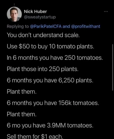
There’s all sorts of bad advice about how people just aren’t trying hard enough to not be poor — if only you saved more money like there is a surfeit of money around to save. Work more like you can add a couple of extra hours to each day or just jam another day into the week. And this guy … who evidently thinks the whole problem is that people don’t understand … scale?

The funniest part to me? This dude wants to start with “you don’t understand scale, I’m gonna educate you …” and then proceeds to not understand scale. Small scale purchases will yield the highest price per pound — someone who is buying tomatoes by the tonne certainly isn’t paying a buck a tomato or even fifty cents a tomato. What’s the price for a tonne of tomatoes? The tomato price per tonne data I’ve found are a little outdated, but lets say $100 a tonne for easy mental math. Even if these tomatoes weigh a pound each (unlikely), then every 2k tomatoes gets you $100. He has about 4 million tomatoes … so 2,000 tonnes of tomatoes @ $100 a tonne grosses $200,000. In addition to not understanding scale, he is not understanding gross v/s net income. And, well, tomatoes.

Even if we ignore the required land (which wouldn’t be trivial — planting 150k tomato plants with adequate spacing is going to be 10+ acres), equipment, and labor required to produce and harvest all of those tomatoes. Say they ripen over a 90 day period (which is super generous in my part of the world, but again pretending it’s reasonable for the sake of argument), you need to move some 44,000 tomatoes A DAY for 90 days. Where are these things going as they get picked? How to I transport them to these hypothetical customers? And who are these customers? Even if every customer buys ten tomatoes a week, I need over 30,000 unique customers (every single one of whom repeats their ten tomato a week purchase for three months straight). Are there actually 30,000 people willing to buy a $10/week tomato subscription for the entire harvest season?

This guy’s hypothetical tomatoes aren’t an example of scale, they’re an example of generational wealth. If you inherited a few thousand acres of land (probably complete with an irrigation system and greenhouses), equipment, warehouses, and a fleet of trucks to move ’em … then maybe you could employ a lot of people for planting, harvesting, and selling at farm markets where you might hope to get something even approaching a buck a tomato. Even then, you aren’t netting hundreds of millions of dollars — you’ve got electrical, transportation, and labor expenses to pay. That’s not building a tomato empire from fifty bucks and a handful of tomato plants — that’s millions of dollars in inherited assets to net maybe a million bucks a year.

Making Statistics Work for You

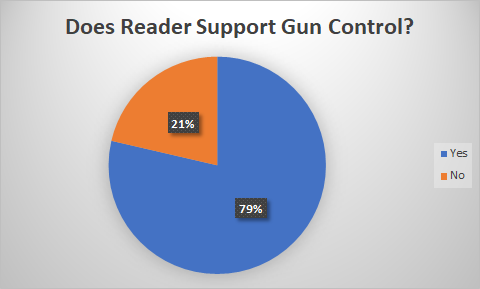
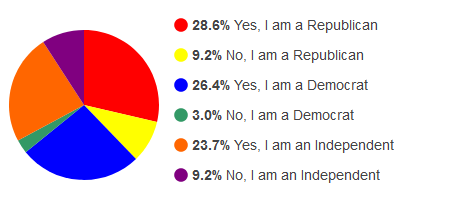
The local newspaper had a poll (in a heavily Republican area) asking if readers support gun control — now they didn’t define “gun control”, so it’s possible some individuals said “no” because they envisioned something unreasonably restrictive or some said “yes” because they think ‘gun control’ includes arming teachers in classrooms or something. Based on the way they elected to bucket the data, there’s no clear “winner”.

But looking at it as just ‘yes’ or ‘no’ — almost 80% of the readers said “yes”

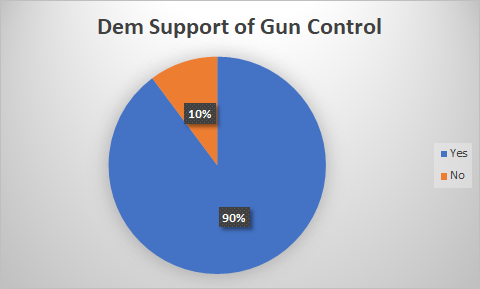
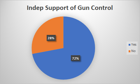
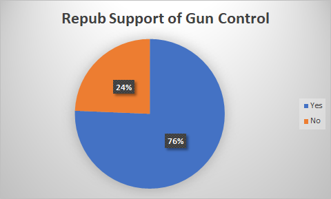
They could break it out by party affiliation and show that only 10% of self-identified Democrats said they don’t support gun control where 28% of self-identified independents and 24% of self-identified Republicans don’t support gun control.

But any of these charts clearly show that a significant majority supports some type of gun control.

Center-Right

I keep seeing that this is a “center right” country, but the election results we’re seeing make me question this analysis. I see ‘center right’ as an average without a standard deviation. If it’s 70 degrees every day, the average temp is 70. If it’s 100 degrees half of the year and 40 the other half, the average temp both places is moderate; but that average hides the two different realities. It’s the standard deviation that shows you how representative an average *is*.
 
If there were a low standard deviation on center-right, then the Democratic party’s would make sense — you’re pretty close to their moderate position, so earning your vote is possible. If there’s a high standard deviation, there’s no appealing to “the other side” — you’re task is to energize people on “your side”, get them enthusiastic about voting, get them engaged in getting their friends out voting.

Influenza Data

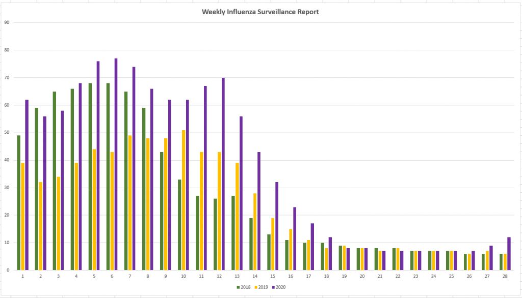
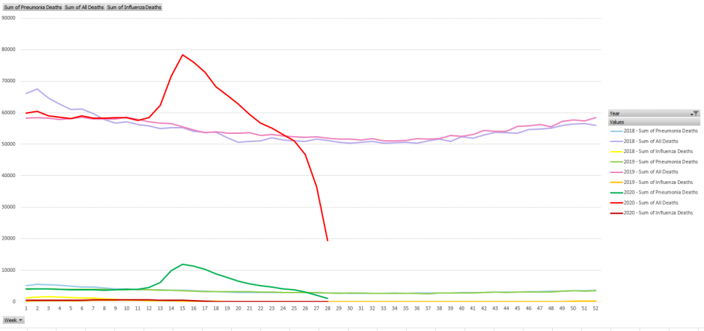
Scott hypothesized that 2020 should have a fairly low rate of illness apart from SARS-CoV-2. The preventative measures taken to limit the spread of this virus should also have reduced the number of people with colds, flu, etc. There’s no way to tell for mild illnesses, but I knew the CDC tracked flu and pneumonia cases … you can link the CDC’s CSV data sources into Excel, create a Pivot table to get rows of week numbers or months & columns of year-by-year case counts, then create a chart that compares case counts year-to-year. Unfortunately, they have a new file name each week. You’ve got to find the latest URL from https://www.cdc.gov/flu/weekly/index.htm

I was surprised to see 2020 significantly higher than the previous two years through the end of April and bumping back up again between weeks 26 and 27 (late June / early July)

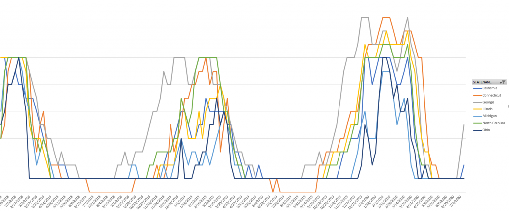
Broken out by state and filtered to a few states to make the chart readable, I see the same trend. 2020 is generally higher than 2019 or 2018.

The significant increase in pneumonia deaths this year? That’s probably not people who actually had pneumonia completely unrelated to SARS-CoV-2. The influenza/pneumonia data set includes an “All Deaths” column — which depicts the excess deaths for 2020 (I assume the past month or so of data is not yet finalized, as thee numbers fall off sharply in the final weeks of the data set).

Mid-stream

Hospitals have been instructed to provide SARS-CoV-2 data to HHS instead of CDC. CDC falls under HHS so it’s a little like having the “parent company” handle something some subsidiary used to do. Which means the move isn’t as alarming as some people are making it out to be. The ‘parent company’ will authority to more readily mobilize resources, and moving responsibility for a project to the parent company can signify the importance of the project.
Which isn’t to say I think it’s a good move … from an IT perspective, CDC has the infrastructure in place to handle the reporting & publicizing of data. About the best case would be a reorganization — same people supporting the same thing, but adding in the uncertainty of a new organizational structure (new processes, new priorities, a new person’s take on what you should be doing). If HHS is taking over that system, there’s opportunity for failure because the new people don’t know what the old people know. If HHS is bring up a new system, there’s a LOT of opportunity for failure because, well, it’s a new system. Mid-disaster isn’t when I’d want to change my reporting process. Maybe run two in parallel because the new one is going to provide some great new insights. But I would never say “hey, everyone, stop using A and move over to B on Thursday”.
Additionally, it doesn’t inspire confidence that the HHS website has been throwing a lot of connection errors since the announcement. I expect it’s a load problem as people begin to learn what HHS is … but ‘the guy who cannot keep his website online will be taking over statistics for us’ is not exactly the direction I’d move critical reporting.

Statistical Coverup

I keep encountering people who cite the fact that “only” half a percent of kids who get SARS-CoV-2 are dangerously ill. A small percentage of a very large number is still *a large number*.
 
The Department of Education estimated 50,800,000 public school students started the 2019-2020 school year. School admission rates have been trending up, but 2019 is the latest available data. Data from the CDC puts ICU admittance for children infected with SARS-CoV-2 at 0.58% (between 0.58% and 2%, but I’ll use the lower number since I haven’t encountered an ‘only two percent’ argument).
 
If only 1% of the kids who enter public school get infected, that’s over 2,500 kids in the ICU. If 5% get infected, that’s over 14,000 in the ICU. I doubt anyone would make the argument “Schools should re-open because only 14k kids are going to end up in the ICU”.

SARS COV-2 Visualizations

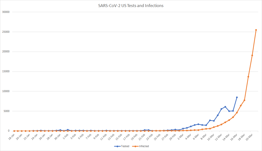
I see charts of the cumulative number of infections (‘the curve’) and the number of tests administered … but comparing the daily number of tests to the cumulative number of infections is not particularly meaningful beyond seeing that the increase in infections is still rather exponential.

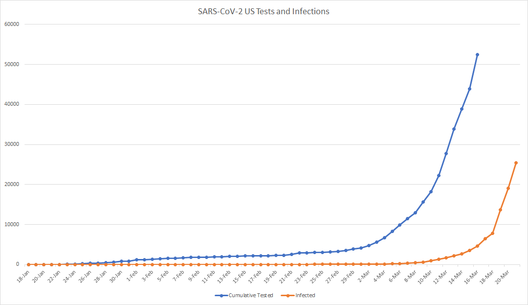
A better visualization compares the cumulative tests to the cumulative infections (or, for less staggering numbers, the daily tests administered and the daily number of new infections identified). No, it doesn’t appear that ‘the curve’ is flattening. I’m curious to see, however, the impact of multiple states going into lock-down has in a week or two.

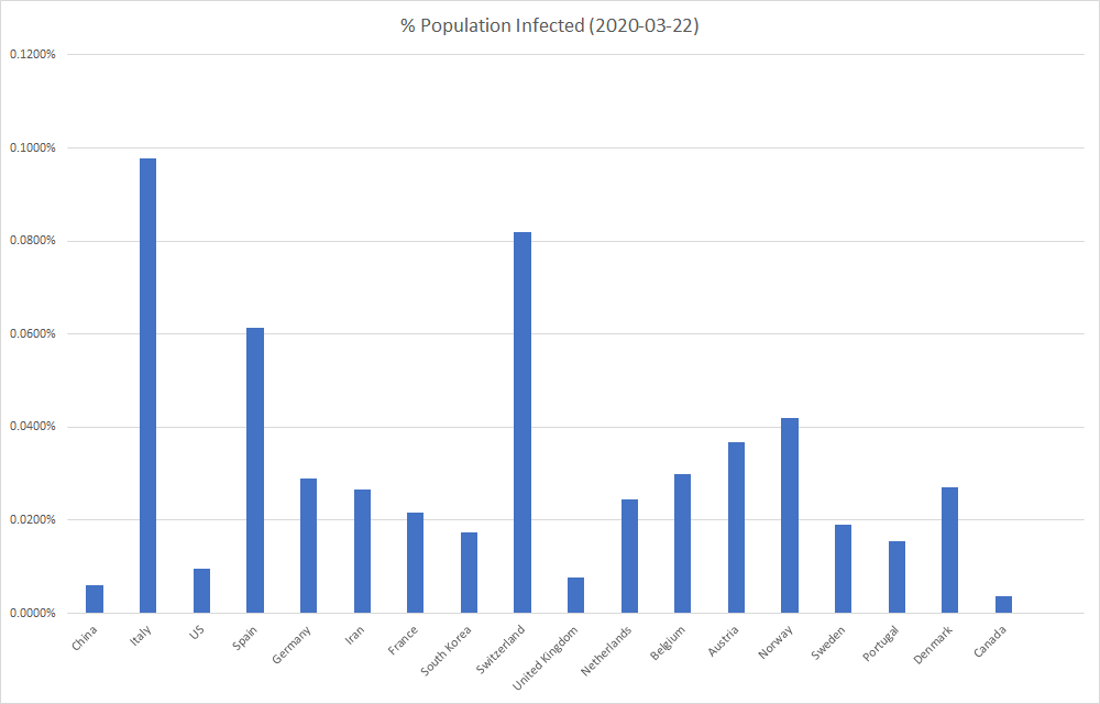
Looking at a number of infections, especially compared across the globe, provides a bit of a distorted view. Comparing countries by the percent of the population that’s been identified as infected instead of the raw number of identified infections avoids the appearance that small countries are less impacted (and that highly populated countries are disproportionately impacted).

Unimaginably Large Numbers

Unimaginably large numbers are, unfortunately, hard to conceptualize. FEMA has delivered 6,200,000 gallons of water to Puerto Rico in the month since Hurricane Maria hit the island. That sounds like a lot of water and probably makes for a good press release. Problem is there are 3.5 million residents. Who should drink half a gallon or so a day (3/4 of a gallon is the WHO recommendation for an adult, but there are kids there too, and I like lazy math). There have been 30 days since the hurricane stuck. Three and a half million people drinking half a gallon of water a day for thirty days is 52,500,000 gallons of water. Not quite 12% of the water needed and my estimate is significantly low.

Doesn’t sound quite so impressive if you say FEMA has delivered 10% of the water needed in Puerto Rico. It also makes breaking into superfund sites to access water more understandable. 100% chance of death if you don’t get water, even an 98% chance of death from poisoning is a better option.