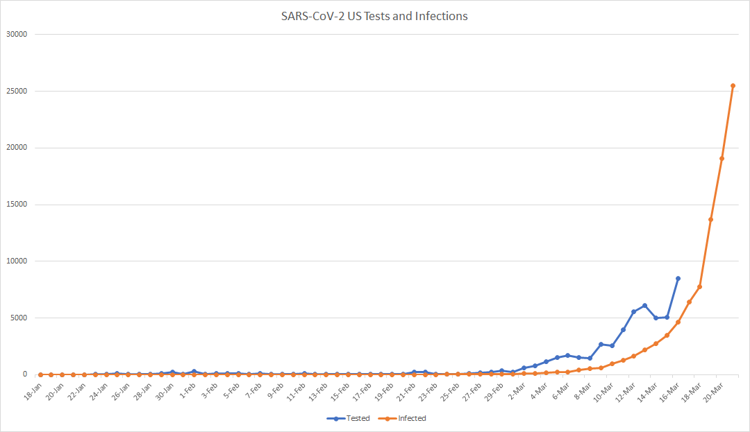
I see charts of the cumulative number of infections (‘the curve’) and the number of tests administered … but comparing the daily number of tests to the cumulative number of infections is not particularly meaningful beyond seeing that the increase in infections is still rather exponential.
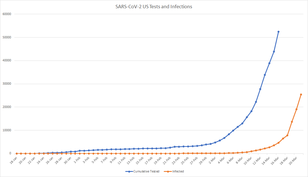
A better visualization compares the cumulative tests to the cumulative infections (or, for less staggering numbers, the daily tests administered and the daily number of new infections identified). No, it doesn’t appear that ‘the curve’ is flattening. I’m curious to see, however, the impact of multiple states going into lock-down has in a week or two.
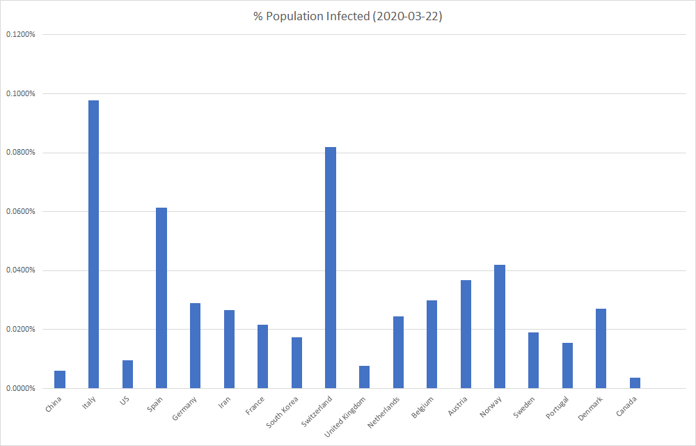
Looking at a number of infections, especially compared across the globe, provides a bit of a distorted view. Comparing countries by the percent of the population that’s been identified as infected instead of the raw number of identified infections avoids the appearance that small countries are less impacted (and that highly populated countries are disproportionately impacted).