Tag: microsoft office 365

Did you know … you can use Microsoft Excel to count the number of records within a range?

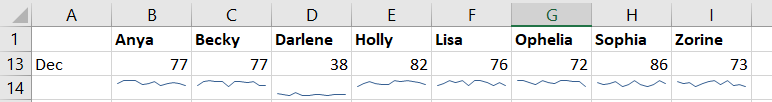
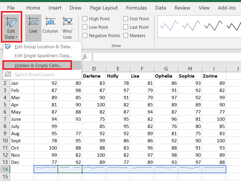
I’ve been generating reports to track our Microsoft Teams adoption – how many people are using Teams, how many messages are being sent in Teams, how many Teams are there. Some of these metrics have easily visualized count-per-unit-time summaries available. Some, like the number of Teams, do not.

Team Created On
Directory Services 1/19/2017
App Proxy 1/19/2017
LDAP 1/19/2017
ADFS 1/19/2017
Nagios 1/19/2017
File Cluster 1/19/2017
Exchange Online 1/19/2017
Active Directory 1/19/2017
Commvault 1/19/2017

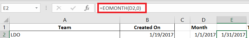
But it’s easy to turn a list of groups and creation dates into visualizable data. Paste the data into Excel. To find the number of items where “Created On” falls in a range, we need to be able to define that range. 01 January 2017 is easy enough, but how do you get the end of January? Excel has a function, EOMONTH, that returns the last day of a month.

Date is any date object. Offset is an integer number of months prior (negative numbers) or after (positive numbers) Date for which you want the last day of the month. I can list the dates to start and end quarters with =EOMonth(Date,2). With 01 January 2017 in cell D2, the last day of January is =EOMonth(D2,0)

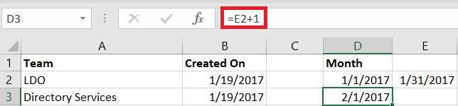
 I don’t want to type01 Feb, Mar, April … flash fill and the fill handle need a few values before they can figure out the rest of a sequence. But I can use the last day of the month to get the first day of the next month – just add one! With 31 January 2017 in cell E2, I want =E2 + 1 in cell D3. (Yes, there are other ways to do this – probably dozens.)

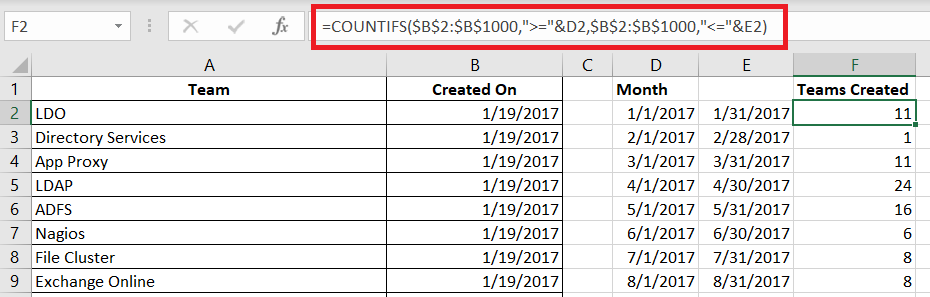
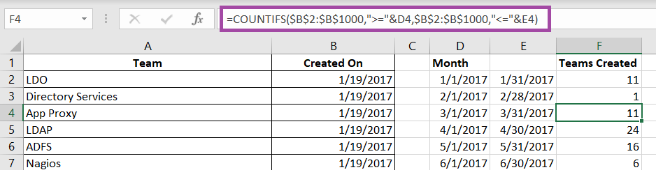
Now that we’ve got a formula for the start and end of the month, just fill down to produce the ranges we need to see how many Teams were created each month. Then we just need a formula to do the counting for us. I use the COUNTIFS function.

=COUNTIFS($B$2:$B$1000,”>=”&D2,$B$2:$B$1000,”<=”&E2)

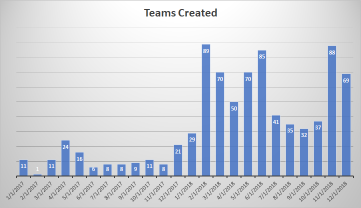
Counts the number of items in the range $B$2:$B$1000 (the cell range is static as the formula is copied elsewhere, hence the

Fill down – you’ll see the range remains static, and the comparison is to the D and E columns on the current row.

Voila – easily visualized data. And a graph 😊

Do you know … Teams Activity View?


The very first icon on the left-hand navigation menu, “Activity”, isn’t just a listing of all unread Teams activity. This view provides a customized view of important Teams communications, allowing you to focus on the most important communication first. 

This isn’t a list of every thing that has been posted to every one of your Teams spaces. It doesn’t even include chat messages sent to you –new chat messages will show up as a red circle with a message count on the“Chat” view icon.

So what shows up in the Activity feed? Missed calls – missed calls are only displayed in your Activity feed. Clicking on the entry will display a chat with the caller; you can reply with a chat message or click the phone icon to return their call.

Posts with @mentions – both your individual mentions and mentions for Teams of which you are a member – will appear in the Activity feed.

Beyond that, you control what appears in your feed. Posts to channels you follow will appear in your feed. To follow a channel, click the“Teams” icon. Click the not-quite-a hamburger menu next to the channel name and select “Follow channel”.

When messages are posted to the channel, you’ll see a red circle with the number 1. This indicates that there is one thread with unread post(s). There may be a bunch of replies in that thread, but the thread is only counted once. This doesn’t mean replies won’t be highlighted – if someone replies to a thread you’ve already read, that thread will again be counted as a thread with unread post(s).

You can click on an entry to display the specific thread. Clicking on a reply will focus on the reply – which helps identify what part of the thread you haven’t seen.

If a channel becomes prolific and irrelevant to you, you can simply stop following the channel. Click the not-quite-a hamburger menu next to the channel name and select “Unfollow this channel”. Anything from the channel in your feed will remain there, but new activity in the channel will cease appearing in your Activity feed.

In addition to a feed of activity from other individuals, you can use the activity feed like the “Sent Items” in your mailbox. Click the inverted caret next to “Feed” and select “My Activity”. You’ll see two weeks of your Teams posts.

Did you know … you can use mini-charts to visualize Excel data?

Using charts and images, data visualization, clearly and efficiently communicates data. But when you’re trying to visualize statistics for several items, your chart can be anything but clear and hardly efficient to read. In this example, I’ve created a line chart depicting the monthly score for eight different people. While you can pick out obvious high or low performance, there’s not a whole lot of information being communicated here.

Did you know Excel can create mini-charts, known as “sparklines” to visualize individual statistics and compare statistics across items? Select the data that you want to compare. From the Insert ribbon bar, look for the “Sparklines” section. I am going to use a “line” style sparkline.

The data range will be selected. Enter the range where you want the mini-charts to display – this can be the row under your data or the column next to your data, or it can be some completely different location.

By default, the y-axis range for each mini-chart depends on the values of the data contained in the chart. This makes comparing the charts a little difficult – the scale is different. In the example below, scores in the 30’s don’t look different than scores in the 80’s.

Click on one of the mini-charts, and a “Design” tab will appear on the ribbon bar. Select it. Under “Axis”, change the minimum and maximum values to “Same for All Sparklines”.

Now you can see how individual performance varied as well as compare individuals.

Blank values will show up as broken lines in the mini-charts. If you do not want to display a gap, return to the “Design” ribbon bar and select “Edit data”. Select “Hidden & Empty Cells”

Select what you want instead of gaps – you can treat null values as zero or have a line drawn between the values on either side of the missing value.