Tag: Vega

Kibana Visualization – Vega Line Chart with Baseline

There’s often a difference between hypothetical (e.g. the physics formula answer) and real results — sometimes this is because sciences will ignore “negligible” factors that can be, well, more than negligible, sometimes this is because the “real world” isn’t perfect. In transmission media, this difference is a measurable “loss” — hypothetically, we know we could send X data in Y delta-time, but we only sent X’. Loss also happens because stuff breaks — metal corrodes, critters nest in fiber junction boxes, dirt builds up on a dish. And it’s not easy, when looking at loss data at a single point in time, to identify what’s normal loss and what’s a problem.

We’re starting a project to record a baseline of loss for all sorts of things — this will allow individuals to check the current loss data against that which engineers say “this is as good as it’s gonna get”. If the current value is close … there’s not a problem. If there’s a big difference … someone needs to go fix something.

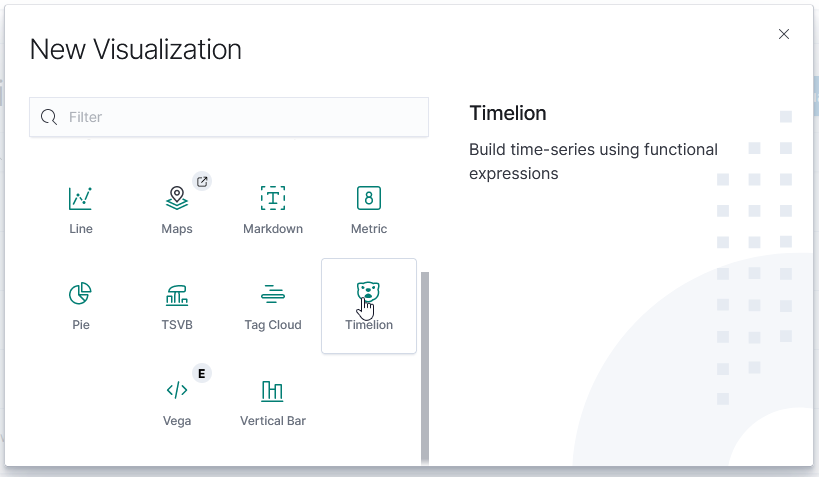
Unfortunately, creating a graph in Kibana that shows the baseline was … not trivial. There is a rule mark that allows you to draw a straight line between two points. You cannot just say “draw a line at ​y​ from 0 to some large value that’s going to be off the graph. The line doesn’t render (say, 0 => today or the year 2525). You cannot just get the max value of the axis.

I finally stumbled across a series of data contortions that make the baseline graphable.

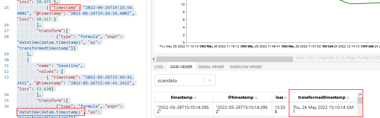
The data sets I have available have a datetime object (when we measured this loss) and a loss value. For scans, there may be lots of scans for a single device. For baselines, there will only be one record.

The joinaggregate transformation method — which appends the value to each element of the data set — was essential because I needed to know the largest datetime value that would appear in the chart.

           , {“type”: “joinaggregate”, “fields”: [“transformedtimestamp”], “ops”: [“max”], “as”: [“maxtime”]}

The lookup transformation method — which can access elements from other data sets — allowed me to get that maximum timestamp value into the baseline data set. Except … lookup needs an exact match in the search field. Luckily, it does return a random (I presume either first or last … but it didn’t matter in this case because all records have the same max date value) record when multiple matches are found.

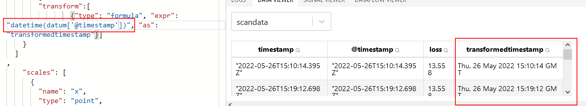
So I used a formula transformation method to add a constant to each record as well

           , {“type”: “formula”, “as”: “pi”, “expr”: “PI”}

Now that there’s a record to be found, I can add the max time from our scan data into our baseline data

                , {“type”: “lookup”, “from”: “scandata”, “key”: “pi”, “fields”: [“pi”], “values”: [“maxtime”], “as”: [“maxtime”]}

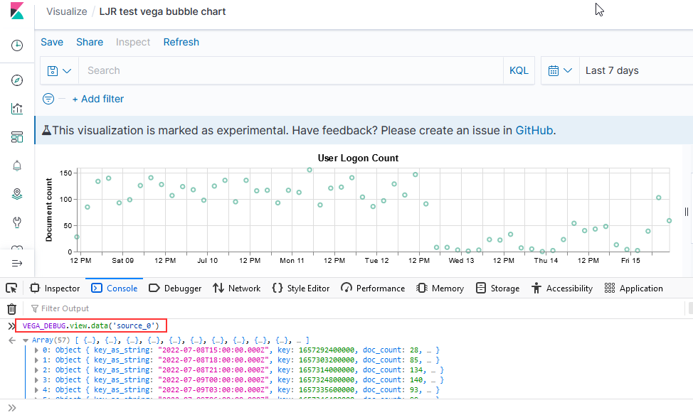
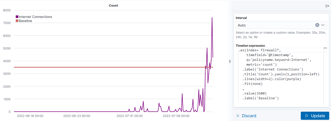
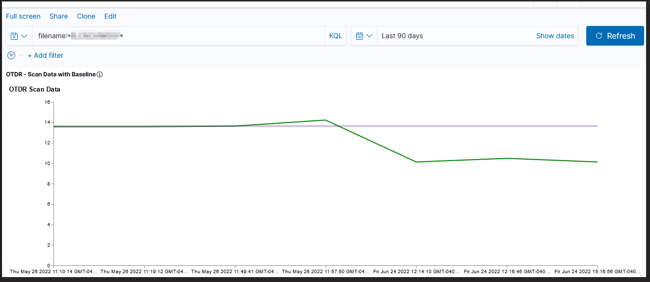
Voila — a chart with a horizontal line at the baseline loss value. Yes, I randomly copied a record to use as the baseline and selected the wrong one (why some scans are below the “good as it’s ever going to get” baseline value!). But … once we have live data coming into the system, we’ll have reasonable looking graphs.

The full Vega spec for this graph:

{
    "$schema": "https://vega.github.io/schema/vega/v4.json",
      "description": "Scan data with baseline",
    "padding": 5,

    "title": {
        "text": "Scan Data",
        "frame": "bounds",
        "anchor": "start",
        "offset": 12,
        "zindex": 0
      },
    "data": [
    {
        "name": "scandata",
        "url": {
            "%context%": true,
            "%timefield%": "@timestamp",
            "index": "traces-*",
            "body": {
            "sort": [{
                "@timestamp": {
                    "order": "asc"
                }
            }],
            "size": 10000,
            "_source":["@timestamp","Events.Summary.total loss"]
            }
        }
        ,"format": { "property": "hits.hits"}
        ,"transform":[
            {"type": "formula", "expr": "datetime(datum._source['@timestamp'])", "as": "transformedtimestamp"}
            , {"type": "joinaggregate", "fields": ["transformedtimestamp"], "ops": ["max"], "as": ["maxtime"]}
            , {"type": "formula", "as": "pi", "expr": "PI"}
        ]
    }
  ,
   {
        "name": "baseline",
        "url": {
            "%context%": true,
            "index": "baselines*",
            "body": {
                "sort": [{
                    "@timestamp": {
                        "order": "desc"
                    }
                }],
                "size": 1,
                "_source":["@timestamp","Events.Summary.total loss"]
            }
        }
        ,"format": { "property": "hits.hits" }
        ,"transform":[
                {"type": "formula", "as": "pi", "expr": "PI"}
                , {"type": "lookup", "from": "scandata", "key": "pi", "fields": ["pi"], "values": ["maxtime"], "as": ["maxtime"]}
        ]
  }
]      
,
    "scales": [
      {
        "name": "x",
        "type": "point",
        "range": "width",
        "domain": {"data": "scandata", "field": "transformedtimestamp"}
      },
      {
        "name": "y",
        "type": "linear",
        "range": "height",
        "nice": true,
        "zero": true,
        "domain": {"data": "scandata", "field": "_source.Events.Summary.total loss"}
      }
    ],
        "axes": [
      {"orient": "bottom", "scale": "x"},
      {"orient": "left", "scale": "y"}
    ],
     "marks": [
                {
            "type": "line",
            "from": {"data": "scandata"},
            "encode": {
              "enter": {
                "x": { "scale": "x", "field": "transformedtimestamp", "type": "temporal",
      "timeUnit": "yearmonthdatehourminute"},
                "y": {"scale": "y",       "type": "quantitative","field": "_source.Events.Summary.total loss"},
                "strokeWidth": {"value": 2},
                "stroke": {"value": "green"}
              }
            }
          }
                 ,        {
            "type": "rule",
            "from": {"data": "baseline"},
            "encode": {
              "enter": {
                "stroke": {"value": "#652c90"},
                "x": {"scale": "x", "value": 0},
                "y": {"scale": "y",      "type": "quantitative","field": "_source.Events.Summary.total loss"},
                "x2": {"scale": "x","field": "maxtime", "type": "temporal"},
                "strokeWidth": {"value": 4},
                "opacity": {"value": 0.3}
              }
            }
          }
     ]         
}

Vega Visualization when Data Element Name Contains At Symbol

We have data created by an external source (i.e. I cannot just change the names used so it works) — the datetime field is named @timestamp and I had an awful time figuring out out how to address that element within a transformation expression.

Just to make sure I wasn’t doing something silly, I created a copy of the data element named without the at symbol. Voila – transformedtimestamp is populated with a datetime element.

This works fine if the data element is named 'timestamp'

I finally figured it out – it appears that I have encountered a JavaScript limitation. Instead of using the dot-notation to access the element, the array subscript method works – not datum.@timestamp in any iteration or with any combination of escapes.

enter image description here


Kibana Vega Chart with Query

I have finally managed to produce a chart that includes a query — I don’t want to have to walk all of the help desk users through setting up the query, although I figured having the ability to select your own time range would be useful.

{
  $schema: https://vega.github.io/schema/vega-lite/v2.json
  title: User Logon Count

  // Define the data source
  data: {
    url: {
      // Which index to search
      index: firewall_logs*

      body: {
        _source: ['@timestamp', 'user', 'action']

"query": {
	"bool": {
		"must": [{
				"query_string": {
					"default_field": "subtype",
					"query": "user"
				}
			},
	   {
				"range": {
					"@timestamp": {
						"%timefilter%": true
                    			}
                  		}
     	}]
	}
}

        
        aggs: {
          time_buckets: {
            date_histogram: {
              field: @timestamp
              interval: {%autointerval%: true}
              extended_bounds: {
                // Use the current time range's start and end
                min: {%timefilter%: "min"}
                max: {%timefilter%: "max"}
              }
              // Use this for linear (e.g. line, area) graphs.  Without it, empty buckets will not show up
              min_doc_count: 0
            }
          }
        }
        size: 0
      }
    }
    format: {property: "aggregations.time_buckets.buckets"}
  }
  mark: point
  encoding: {
    x: {
      field: key
      type: temporal
      axis: {title: false} // Don't add title to x-axis
    }
    y: {
      field: doc_count
      type: quantitative
      axis: {title: "Document count"}
    }
  }
}

Debugging Vega Graphs in Kibana

If you open the browser’s developer console, you can access debugging information. This works when you are editing a visualization as well as when you are viewing one. To see a list of available functions, type VEGA_DEBUG. and a drop-down will show you what’s available. The command “VEGA_DEBUG.vega_spec” outputs pretty much everything about the chart.

To access the data set being graphed with the Vega Lite grammar, use “VEGA_DEBUG.view.data(“source_0)” — if you are using the Vega grammar, use the dataset name that you have defined.

Kibana – Visualizations and Dashboards

Kibana – Creating Visualizations

General

Time Series Visualization Pipeline

Kibana – Creating a Dashboard

Kibana – Creating Visualizations

General

To create a new visualization, select the visualization icon from the left-hand navigation menu and click “Create visualization”. You’ll need to select the type of visualization you want to create.

TSVB (Time Series Visualization Builder)

The Time Series Visualization Pipeline is a GUI visualization builder to create graphs from time series data. This means the x-axis will be datetime values and the y-axis will the data you want to visualize over the time period. To create a new visualization of this type, select “TSVB” on the “New Visualization” menu.

Scroll down and select “Panel options” – here you specify the index you want to visualize. Select the field that will be used as the time for each document (e.g. if your document has a special field like eventOccuredAt, you’d select that here). I generally leave the time interval at ‘auto’ – although you might specifically want to present a daily or hourly report.

Once you have selected the index, return to the “Data” tab. First, select the type of aggregation you want to use. In this example, we are showing the number of documents for a variety of policies.

The “Group by” dropdown allows you to have chart lines for different categories (instead of just having the count of documents over the time series, which is what “Everything” produces) – to use document data to create the groupings, select “Terms”.

Select the field you want to group on – in this case, I want the count for each unique “policyname” value, so I selected “policyname.keyword” as the grouping term.

Voila – a time series chart showing how many documents are found for each policy name. Click “Save” at the top left of the chart to save the visualization.

Provide a name for the visualization, write a brief description, and click “Save”. The visualization will now be available for others to view or for inclusion in dashboards.

TimeLion

TimeLion looks like it is going away soon, but it’s what I’ve seen as the recommendation for drawing horizontal lines on charts.

This visualization type is a little cryptic – you need to enter Timelion expression — .es() retrieves data from ElasticSearch, .value(3500) draws a horizontal line at 3,500

If there is null data at a time value, TimeLion will draw a discontinuous line. You can modify this behavior by specifying a fit function.

Note that you’ll need to click “Update” to update the chart before you are able to save the visualization.

Vega

Vega is an experimental visualization type.

This is, by far, the most flexible but most complex approach to creating a visualization. I’ve used it to create the Sankey visualization showing the source and destination countries from our firewall logs. Both Vega and Vega-Lite grammars can be used. ElasticCo provides a getting started guide, and there are many example online that you can use as the basis for your visualization.

Kibana – Creating a Dashboard

To create a dashboard, select the “Dashboards” icon on the left-hand navigation bar. Click “Create dashboard”

Click “Add an existing” to add existing visualizations to the dashboard.

Select the dashboards you want added, then click “Save” to save your dashboard.

Provide a name and brief description, then click “Save”.


Kibana Sankey Visualization

Now that we’ve got a lot of data being ingested into our ELK platform, I am beginning to build out visualizations and dashboards. This Vega visualization (source below) shows the number of connections between source and destination countries.

{ 
  $schema: https://vega.github.io/schema/vega/v3.0.json
  data: [
    {
      // Respect currently selected time range and filter string
      name: rawData
      url: {
        %context%: true
        %timefield%: @timestamp
        index: firewall_logs*
        body: {
          size: 0
          aggs: {
            table: {
              composite: {
                size: 10000
                sources: [
                  {
                    source_country: {
                     terms: {field: "srccountry.keyword"}
                    }
                  }
                  {
                    dest_country: {
                     terms: {field: "dstcountry.keyword"}
                    }
                  }
                ]
              }
            }
          }
        }
      }
      format: {property: "aggregations.table.buckets"}
      // Add aliases for data.* elements
      transform: [
        {type: "formula", expr: "datum.key.source_country", as: "source_country"}
        {type: "formula", expr: "datum.key.dest_country", as: "dest_country"}
        {type: "formula", expr: "datum.doc_count", as: "size"}
      ]
    }
    {
      name: nodes
      source: rawData
      transform: [
        // Filter to selected country
        {
          type: filter
          expr: !groupSelector || groupSelector.source_country == datum.source_country || groupSelector.dest_country == datum.dest_country
        }
        {type: "formula", expr: "datum.source_country+datum.dest_country", as: "key"}
        {
          type: fold
          fields: ["source_country", "dest_country"]
          as: ["stack", "grpId"]
        }
        {
          type: formula
          expr: datum.stack == 'source_country' ? datum.source_country+' '+datum.dest_country : datum.dest_country+' '+datum.source_country
          as: sortField
        }
        {
          type: stack
          groupby: ["stack"]
          sort: {field: "sortField", order: "descending"}
          field: size
        }
        {type: "formula", expr: "(datum.y0+datum.y1)/2", as: "yc"}
      ]
    }
    {
      name: groups
      source: nodes
      transform: [
        // Aggregate country groups and include number of documents for each grouping
        {
          type: aggregate
          groupby: ["stack", "grpId"]
          fields: ["size"]
          ops: ["sum"]
          as: ["total"]
        }
        {
          type: stack
          groupby: ["stack"]
          sort: {field: "grpId", order: "descending"}
          field: total
        }
        {type: "formula", expr: "scale('y', datum.y0)", as: "scaledY0"}
        {type: "formula", expr: "scale('y', datum.y1)", as: "scaledY1"}
        {type: "formula", expr: "datum.stack == 'source_country'", as: "rightLabel"}
        {
          type: formula
          expr: datum.total/domain('y')[1]
          as: percentage
        }
      ]
    }
    {
      name: destinationNodes
      source: nodes
      transform: [
        {type: "filter", expr: "datum.stack == 'dest_country'"}
      ]
    }
    {
      name: edges
      source: nodes
      transform: [
        {type: "filter", expr: "datum.stack == 'source_country'"}
        {
          type: lookup
          from: destinationNodes
          key: key
          fields: ["key"]
          as: ["target"]
        }
        {
          type: linkpath
          orient: horizontal
          shape: diagonal
          sourceY: {expr: "scale('y', datum.yc)"}
          sourceX: {expr: "scale('x', 'source_country') + bandwidth('x')"}
          targetY: {expr: "scale('y', datum.target.yc)"}
          targetX: {expr: "scale('x', 'dest_country')"}
        }
        // Calculation to determine line thickness
        {
          type: formula
          expr: range('y')[0]-scale('y', datum.size)
          as: strokeWidth
        }
        {
          type: formula
          expr: datum.size/domain('y')[1]
          as: percentage
        }
      ]
    }
  ]
  scales: [
    {
      name: x
      type: band
      range: width
      domain: ["source_country", "dest_country"]
      paddingOuter: 0.05
      paddingInner: 0.95
    }
    {
      name: y
      type: linear
      range: height
      domain: {data: "nodes", field: "y1"}
    }
    {
      name: color
      type: ordinal
      range: category
      domain: {data: "rawData", fields: ["source_country", "dest_country"]}
    }
    {
      name: stackNames
      type: ordinal
      range: ["Source Country", "Destination Country"]
      domain: ["source_country", "dest_country"]
    }
  ]
  axes: [
    {
      orient: bottom
      scale: x
      encode: {
        labels: {
          update: {
            text: {scale: "stackNames", field: "value"}
          }
        }
      }
    }
    {orient: "left", scale: "y"}
  ]
  marks: [
    {
      type: path
      name: edgeMark
      from: {data: "edges"}
      clip: true
      encode: {
        update: {
          stroke: [
            {
              test: groupSelector && groupSelector.stack=='source_country'
              scale: color
              field: dest_country
            }
            {scale: "color", field: "source_country"}
          ]
          strokeWidth: {field: "strokeWidth"}
          path: {field: "path"}
          strokeOpacity: {
            signal: !groupSelector && (groupHover.source_country == datum.source_country || groupHover.dest_country == datum.dest_country) ? 0.9 : 0.3
          }
          zindex: {
            signal: !groupSelector && (groupHover.source_country == datum.source_country || groupHover.dest_country == datum.dest_country) ? 1 : 0
          }
          tooltip: {
            signal: datum.source_country + ' → ' + datum.dest_country + '    ' + format(datum.size, ',.0f') + '   (' + format(datum.percentage, '.1%') + ')'
          }
        }
        hover: {
          strokeOpacity: {value: 1}
        }
      }
    }
    {
      type: rect
      name: groupMark
      from: {data: "groups"}
      encode: {
        enter: {
          fill: {scale: "color", field: "grpId"}
          width: {scale: "x", band: 1}
        }
        update: {
          x: {scale: "x", field: "stack"}
          y: {field: "scaledY0"}
          y2: {field: "scaledY1"}
          fillOpacity: {value: 0.6}
          tooltip: {
            signal: datum.grpId + '   ' + format(datum.total, ',.0f') + '   (' + format(datum.percentage, '.1%') + ')'
          }
        }
        hover: {
          fillOpacity: {value: 1}
        }
      }
    }
    {
      type: text
      from: {data: "groups"}
      interactive: false
      encode: {
        update: {
          x: {
            signal: scale('x', datum.stack) + (datum.rightLabel ? bandwidth('x') + 8 : -8)
          }
          yc: {signal: "(datum.scaledY0 + datum.scaledY1)/2"}
          align: {signal: "datum.rightLabel ? 'left' : 'right'"}
          baseline: {value: "middle"}
          fontWeight: {value: "bold"}
          // Do not show labels on smaller items
          text: {signal: "abs(datum.scaledY0-datum.scaledY1) > 13 ? datum.grpId : ''"}
        }
      }
    }
    {
      type: group
      data: [
        {
          name: dataForShowAll
          values: [{}]
          transform: [{type: "filter", expr: "groupSelector"}]
        }
      ]
      // Set button size and positioning
      encode: {
        enter: {
          xc: {signal: "width/2"}
          y: {value: 30}
          width: {value: 80}
          height: {value: 30}
        }
      }
      marks: [
        {
          type: group
          name: groupReset
          from: {data: "dataForShowAll"}
          encode: {
            enter: {
              cornerRadius: {value: 6}
              fill: {value: "#f5f5f5"}
              stroke: {value: "#c1c1c1"}
              strokeWidth: {value: 2}
              // use parent group's size
              height: {
                field: {group: "height"}
              }
              width: {
                field: {group: "width"}
              }
            }
            update: {
              opacity: {value: 1}
            }
            hover: {
              opacity: {value: 0.7}
            }
          }
          marks: [
            {
              type: text
              interactive: false
              encode: {
                enter: {
                  xc: {
                    field: {group: "width"}
                    mult: 0.5
                  }
                  yc: {
                    field: {group: "height"}
                    mult: 0.5
                    offset: 2
                  }
                  align: {value: "center"}
                  baseline: {value: "middle"}
                  fontWeight: {value: "bold"}
                  text: {value: "Show All"}
                }
              }
            }
          ]
        }
      ]
    }
  ]
  signals: [
    {
      name: groupHover
      value: {}
      on: [
        {
          events: @groupMark:mouseover
          update: "{source_country:datum.stack=='source_country' && datum.grpId, dest_country:datum.stack=='dest_country' && datum.grpId}"
        }
        {events: "mouseout", update: "{}"}
      ]
    }
    {
      name: groupSelector
      value: false
      on: [
        {
          events: @groupMark:click!
          update: "{stack:datum.stack, source_country:datum.stack=='source_country' && datum.grpId, dest_country:datum.stack=='dest_country' && datum.grpId}"
        }
        {
          events: [
            {type: "click", markname: "groupReset"}
            {type: "dblclick"}
          ]
          update: "false"
        }
      ]
    }
  ]
}