Kibana – Creating Visualizations
Time Series Visualization Pipeline
Kibana – Creating Visualizations
General
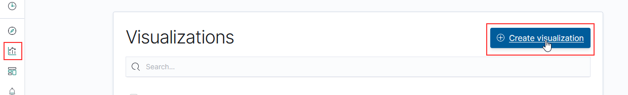
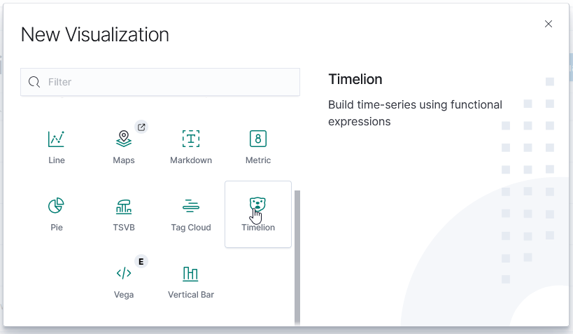
To create a new visualization, select the visualization icon from the left-hand navigation menu and click “Create visualization”. You’ll need to select the type of visualization you want to create.
TSVB (Time Series Visualization Builder)
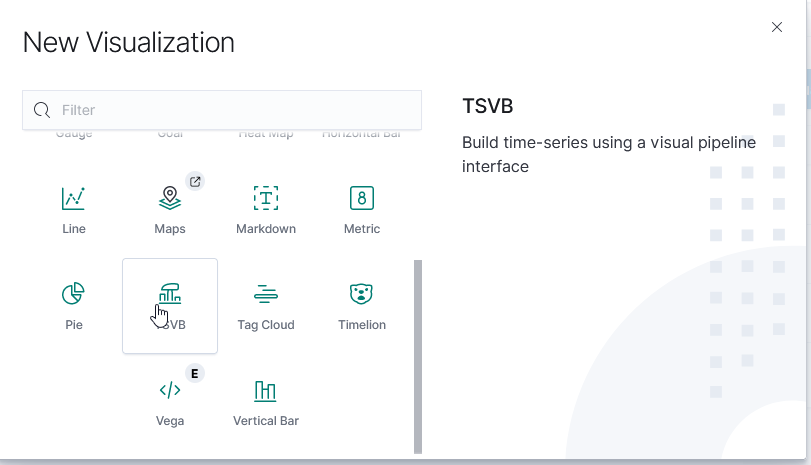
The Time Series Visualization Pipeline is a GUI visualization builder to create graphs from time series data. This means the x-axis will be datetime values and the y-axis will the data you want to visualize over the time period. To create a new visualization of this type, select “TSVB” on the “New Visualization” menu.
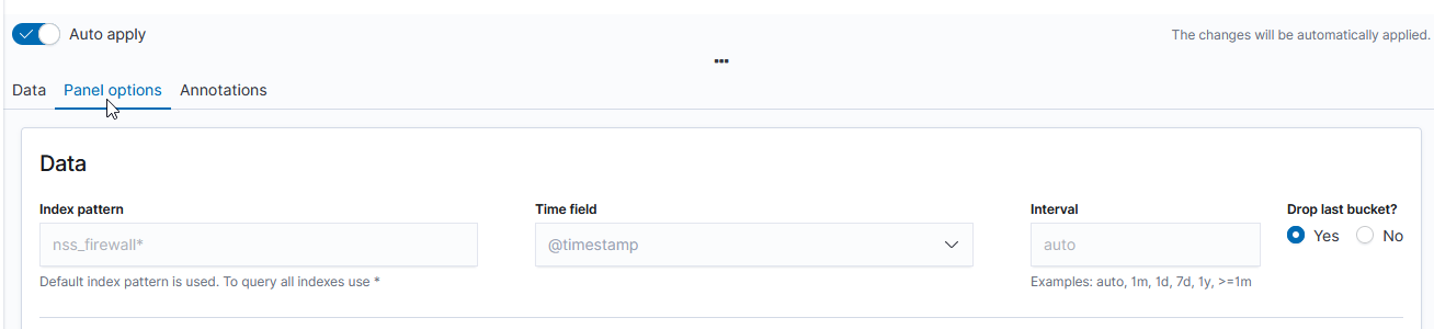
Scroll down and select “Panel options” – here you specify the index you want to visualize. Select the field that will be used as the time for each document (e.g. if your document has a special field like eventOccuredAt, you’d select that here). I generally leave the time interval at ‘auto’ – although you might specifically want to present a daily or hourly report.
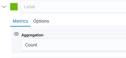
Once you have selected the index, return to the “Data” tab. First, select the type of aggregation you want to use. In this example, we are showing the number of documents for a variety of policies.
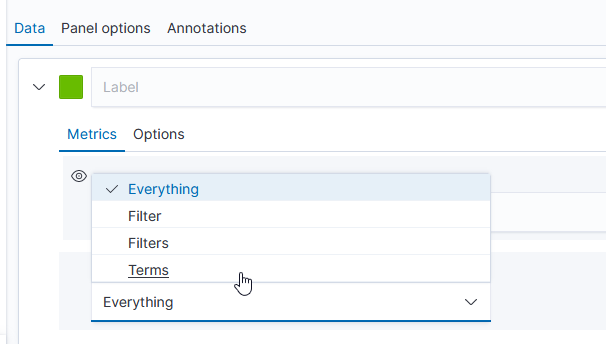
The “Group by” dropdown allows you to have chart lines for different categories (instead of just having the count of documents over the time series, which is what “Everything” produces) – to use document data to create the groupings, select “Terms”.
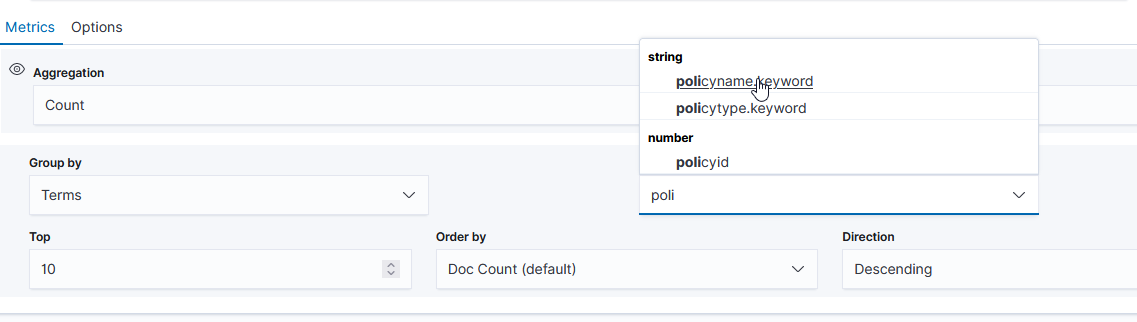
Select the field you want to group on – in this case, I want the count for each unique “policyname” value, so I selected “policyname.keyword” as the grouping term.
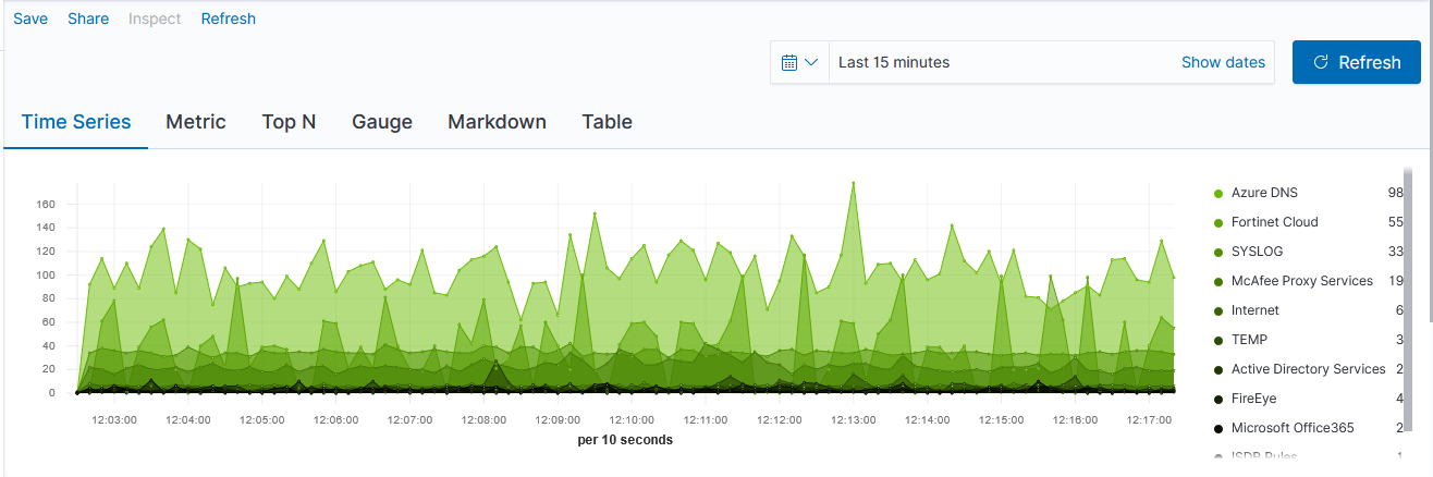
Voila – a time series chart showing how many documents are found for each policy name. Click “Save” at the top left of the chart to save the visualization.
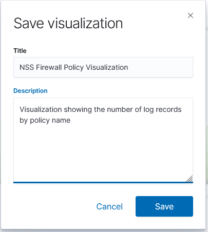
Provide a name for the visualization, write a brief description, and click “Save”. The visualization will now be available for others to view or for inclusion in dashboards.
TimeLion
TimeLion looks like it is going away soon, but it’s what I’ve seen as the recommendation for drawing horizontal lines on charts.
This visualization type is a little cryptic – you need to enter Timelion expression — .es() retrieves data from ElasticSearch, .value(3500) draws a horizontal line at 3,500
If there is null data at a time value, TimeLion will draw a discontinuous line. You can modify this behavior by specifying a fit function.
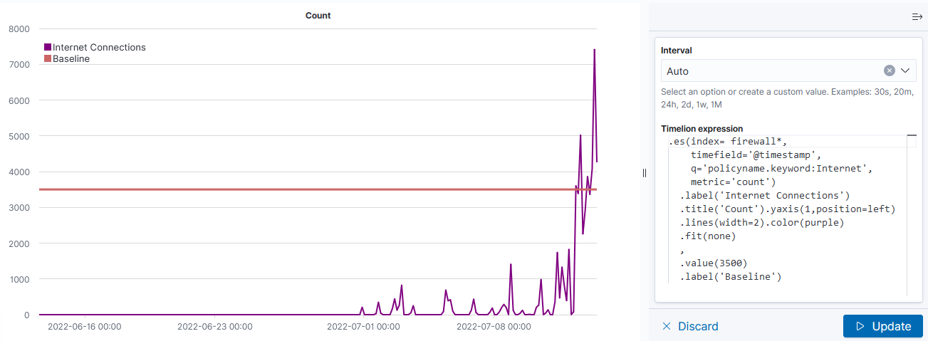
Note that you’ll need to click “Update” to update the chart before you are able to save the visualization.
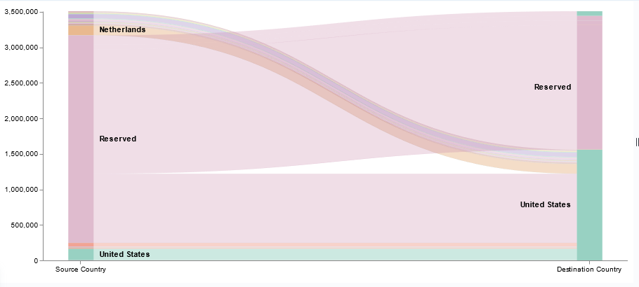
Vega
Vega is an experimental visualization type.

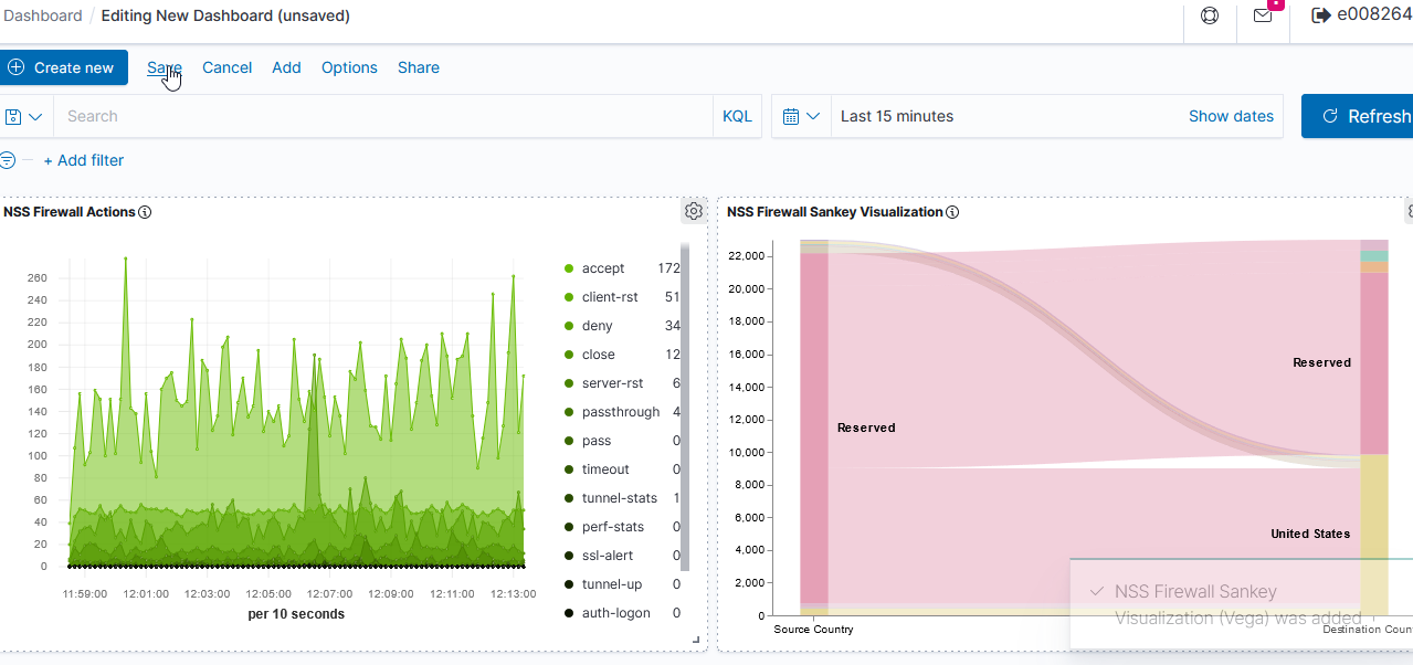
This is, by far, the most flexible but most complex approach to creating a visualization. I’ve used it to create the Sankey visualization showing the source and destination countries from our firewall logs. Both Vega and Vega-Lite grammars can be used. ElasticCo provides a getting started guide, and there are many example online that you can use as the basis for your visualization.
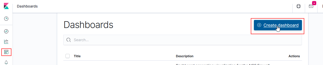
Kibana – Creating a Dashboard
To create a dashboard, select the “Dashboards” icon on the left-hand navigation bar. Click “Create dashboard”
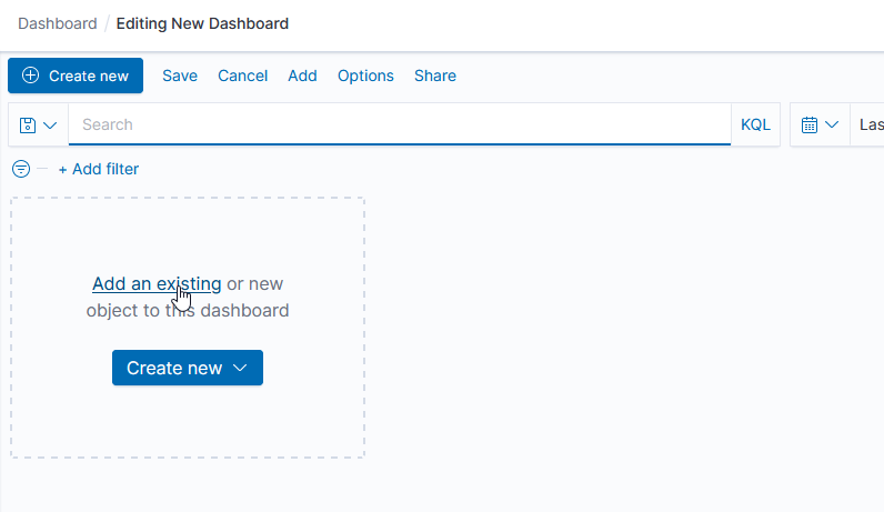
Click “Add an existing” to add existing visualizations to the dashboard.
Select the dashboards you want added, then click “Save” to save your dashboard.
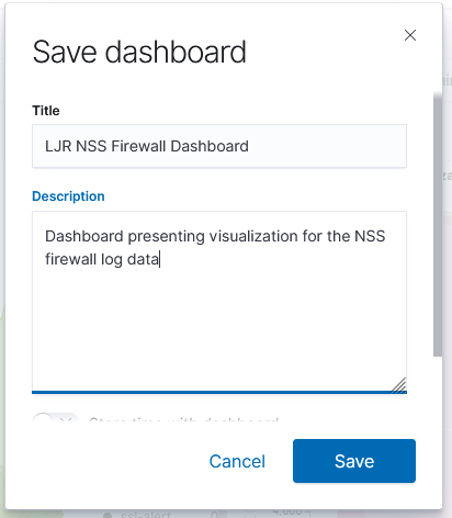
Provide a name and brief description, then click “Save”.