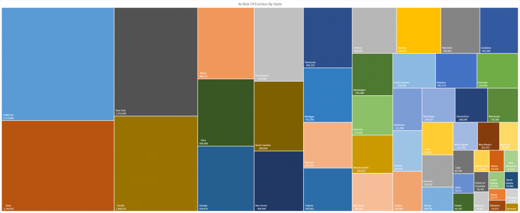
Tonight, I saw a post about the percent of rental households facing eviction — a staggering statistic on its own, but percentages can hide large or small numbers. 22% or 55% of households facing eviction sounds awful, but how awful depends on how many households rent or own in the state. The government, however, publishes a lot of data about US households. Data profiles for 2018 are available, so I’m using the number of renters by state in 2018 to translate percentages into households.
This chart represents 18 million households facing eviction — this is housing units, not number of people. One household may be one person or it may be ten people.
Beyond the immediately obvious question of “where are all of these people going once they are evicted?, there is peripheral impact — a lot of rental units are financed. How are property owners paying when a quarter of their rental units vacant? Are their kids still going to school? The government insisted on rescuing “too big to fail” banks. Ten or twenty million homeless people across the country seems more dire. Yet our government cannot pass an unemployment extension in a timely fashion.
There’s a historical hypothesis that the relative stability of the past couple hundred years was achieved by maintaining a large middle class. People constantly plagued by poverty and starvation are open to suggested alternatives — what do you have to lose? But give 60% a little something — a decent place to live, enough food, transportation, a little extra money for “fun stuff” and you’ve got a populace invested in maintaining the status quo (however inequitable that may be). Mass unemployment and homelessness is the stuff of mass protest and revolution.