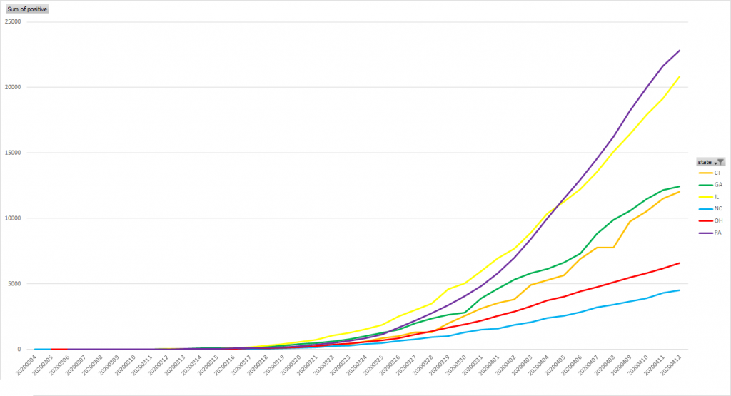
Updated graph for current infection numbers
And the states kinda like Ohio graph where I still think “distance from NYC” is a pretty significant factor in how many individuals are infected. Ohio, going on a month of kids out of school and entering week three of the shelter-in-place order, isn’t seeing the exponential growth some states with similar population numbers have encountered.